Crack & Hammer
Branding, Illustration, Print
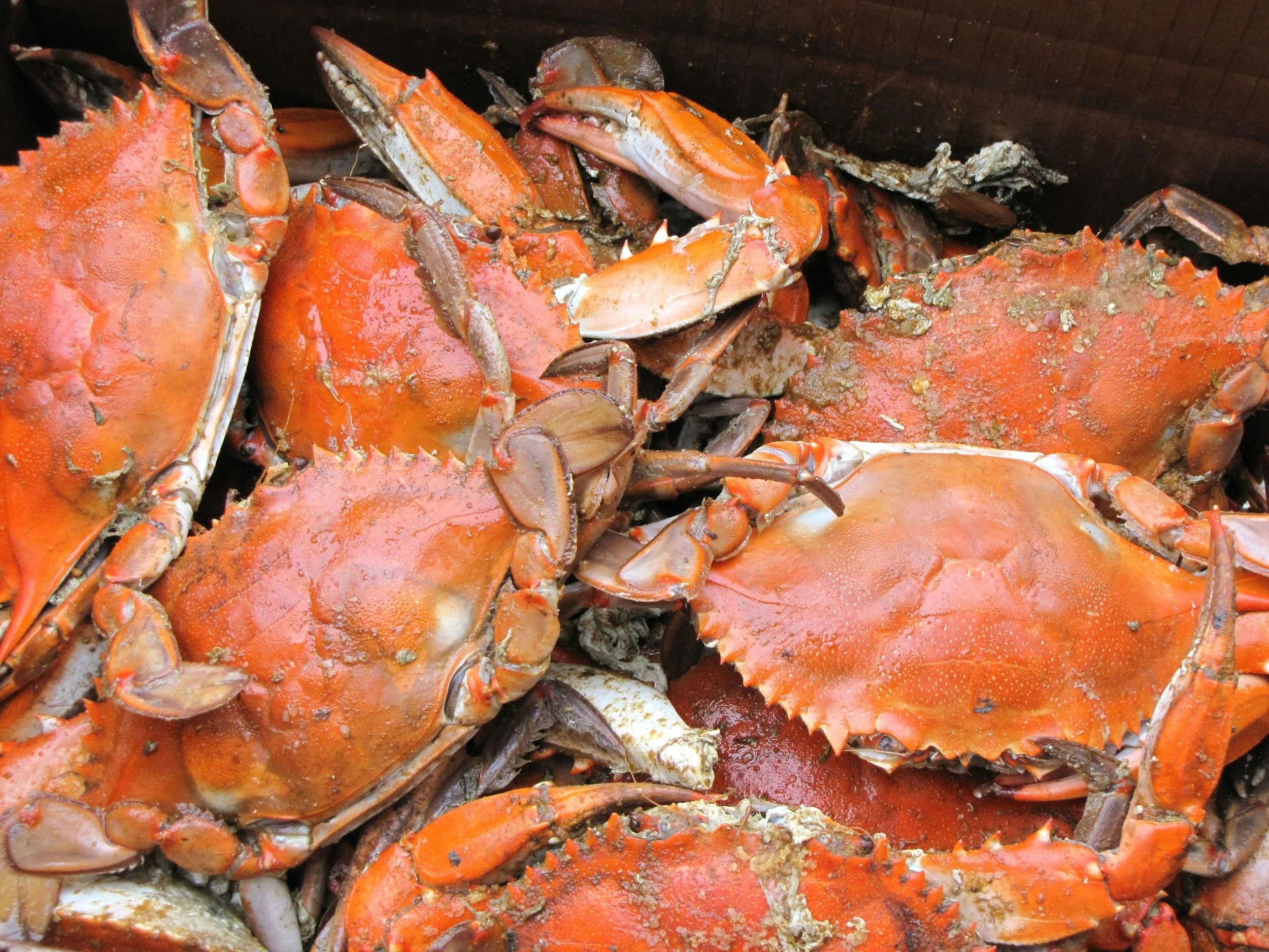
As the weather warms up in Maryland, one of the first things I look forward to is a good crab feast. The sense of community from sitting around a messy table covered in brown paper while everyone breaks into each crab is near and dear to me. So I thought, why not brand my own crab feast restaurant that embodies the casual, messy, and fun memories I was raised with?
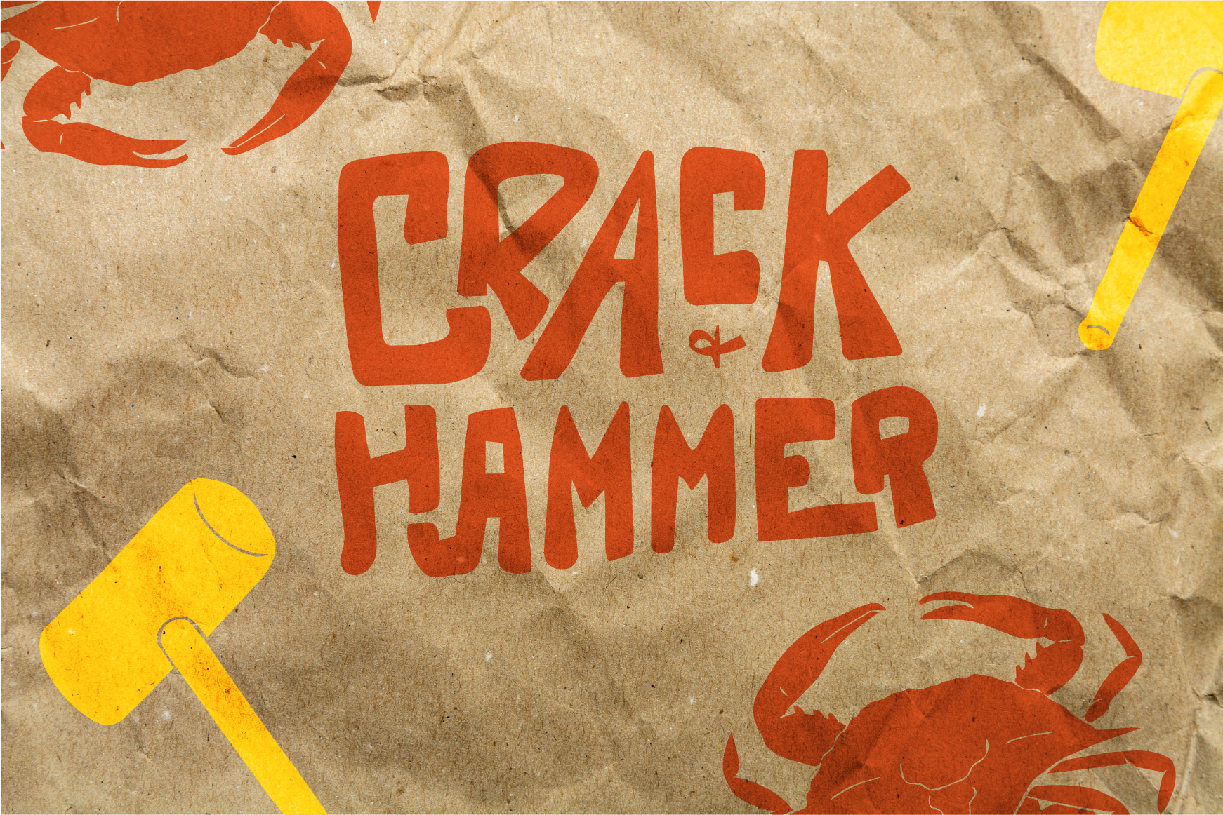
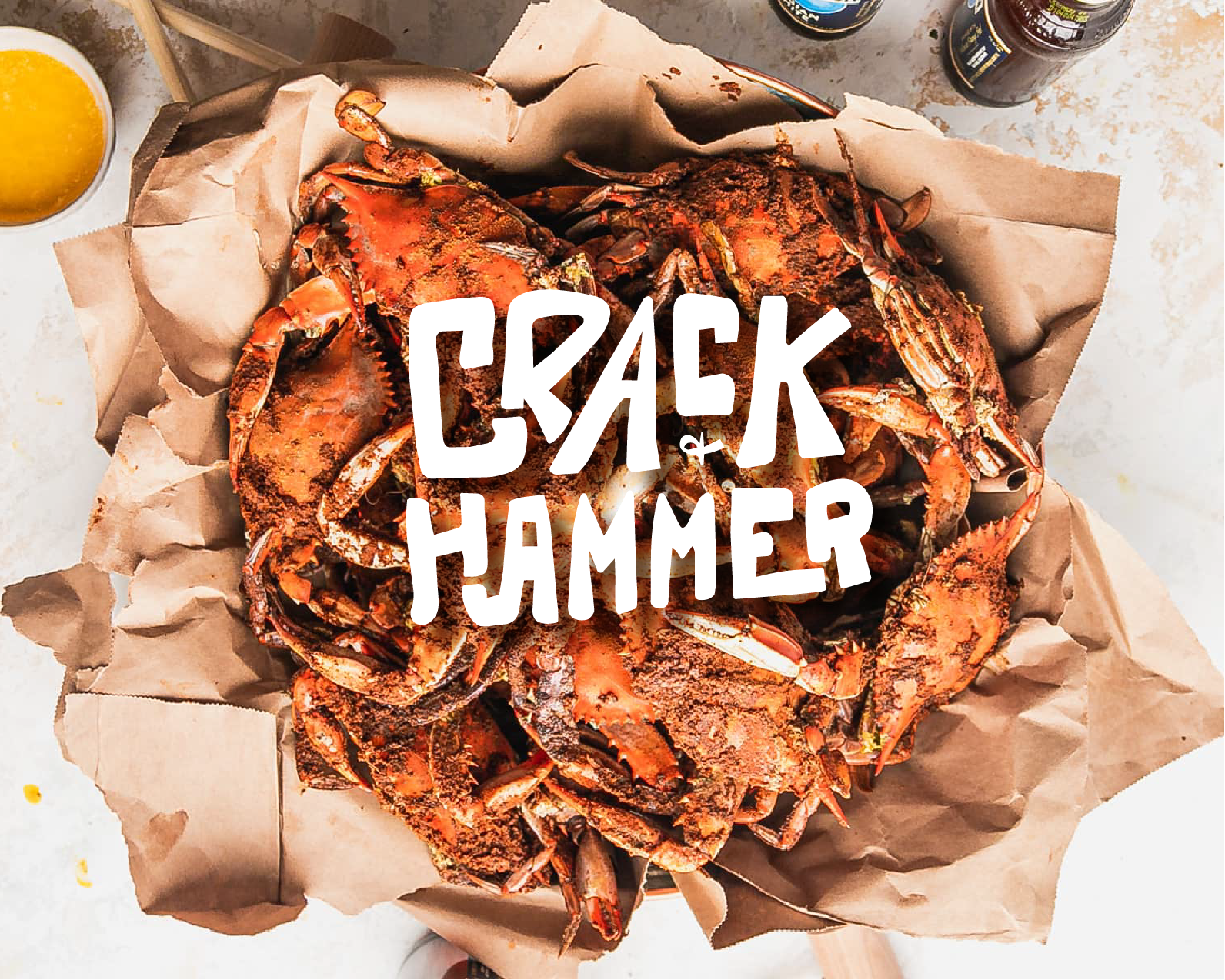
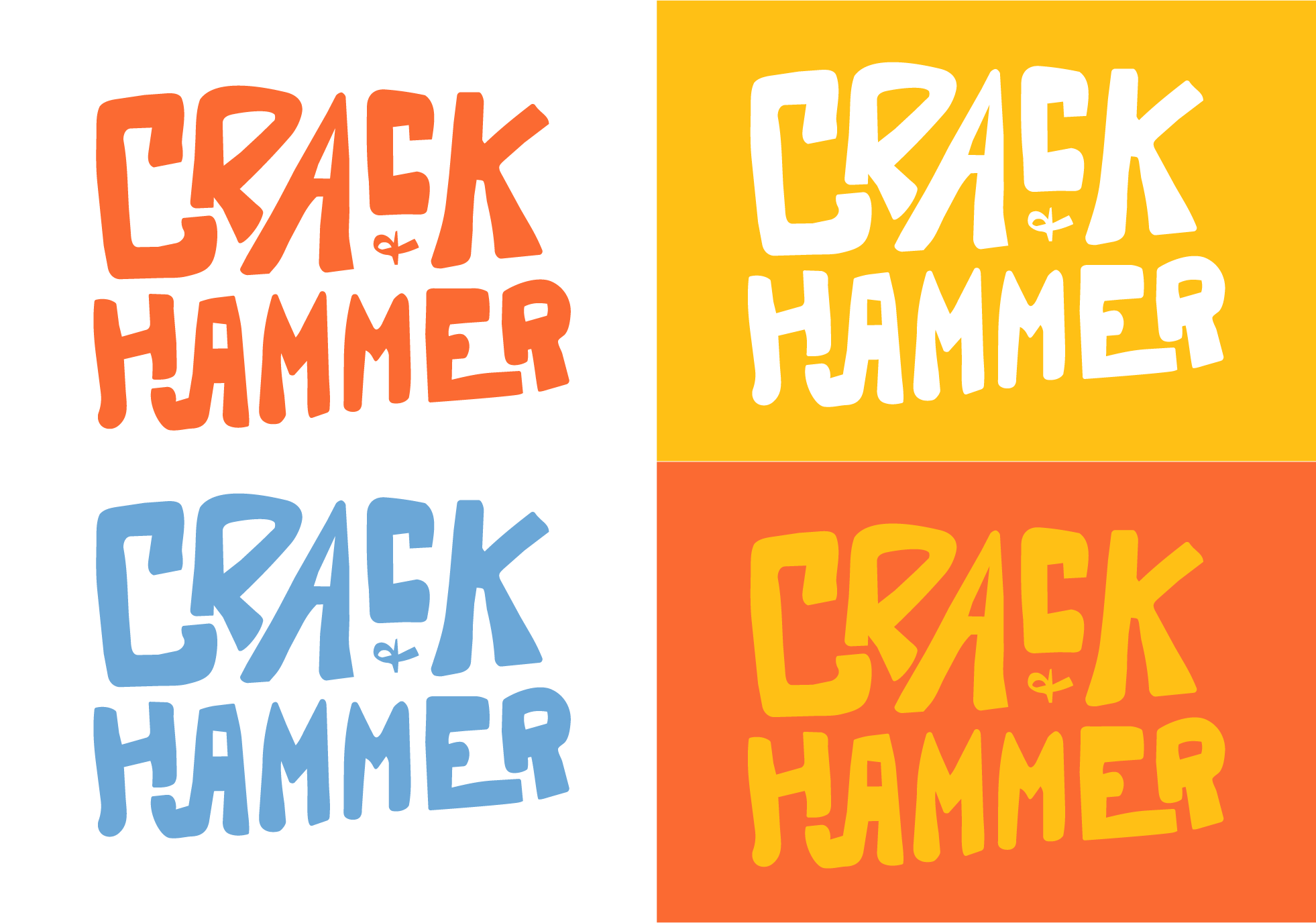
I thought a handwritten logo would work best, so I used Procreate to bring the logo to life, along with quirky icons that would add to its playfulness. The wonky linework brought it all together. For the color palette, I was inspired by the blue of blue crabs, the delicious orange when they’re steamed, buttery yellow, and the brown paper covering the tables. The name, Crack & Hammer, is inspired by the loud memories of constant cracking and banging to get to the good meat inside the claws.
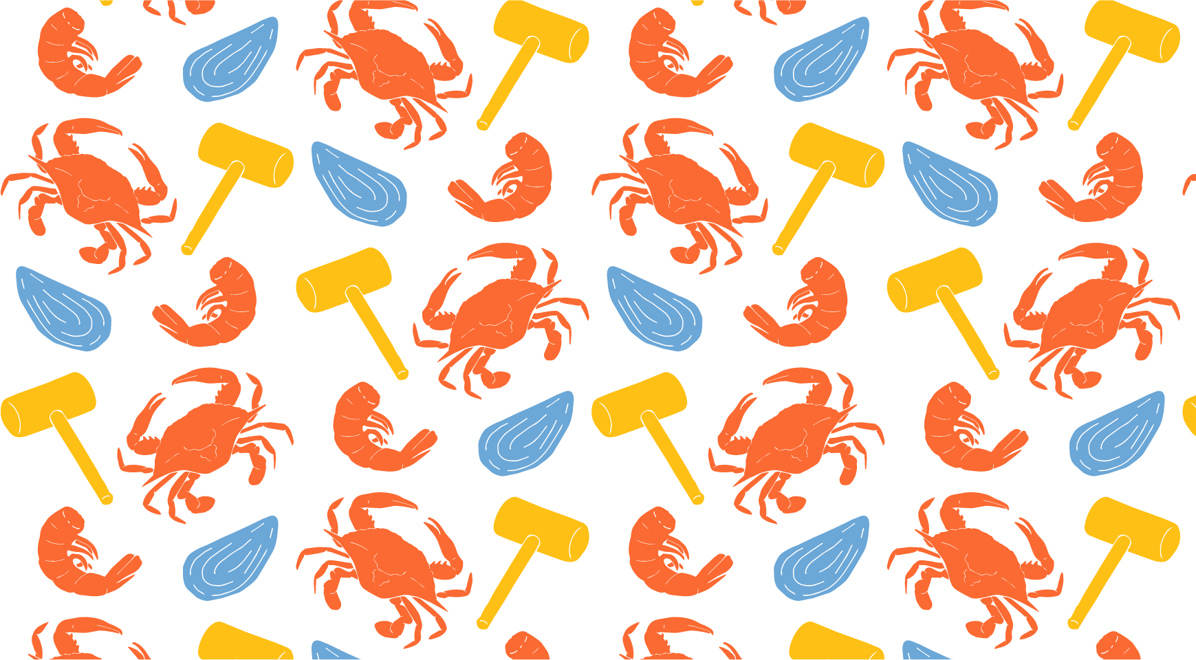
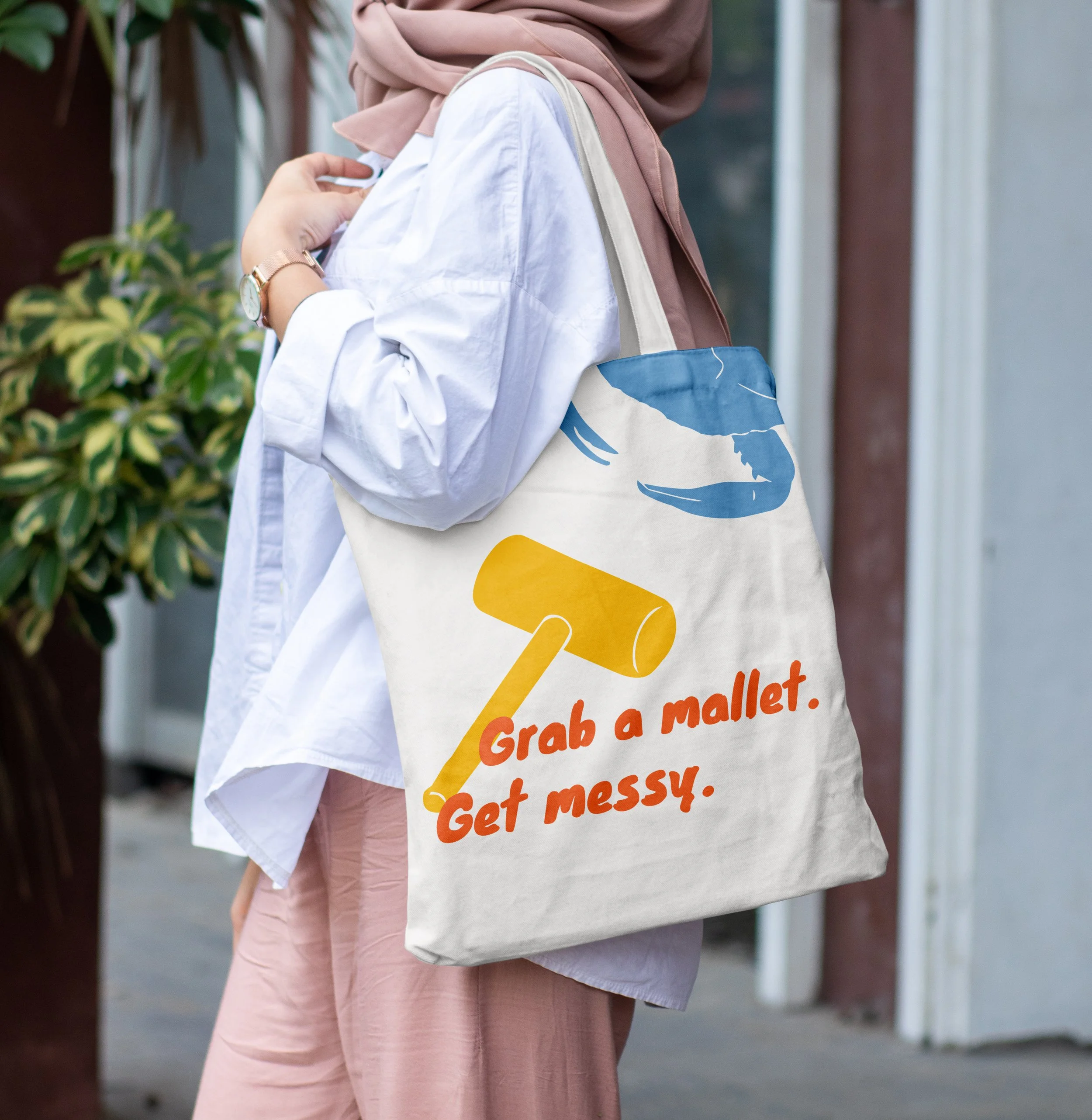
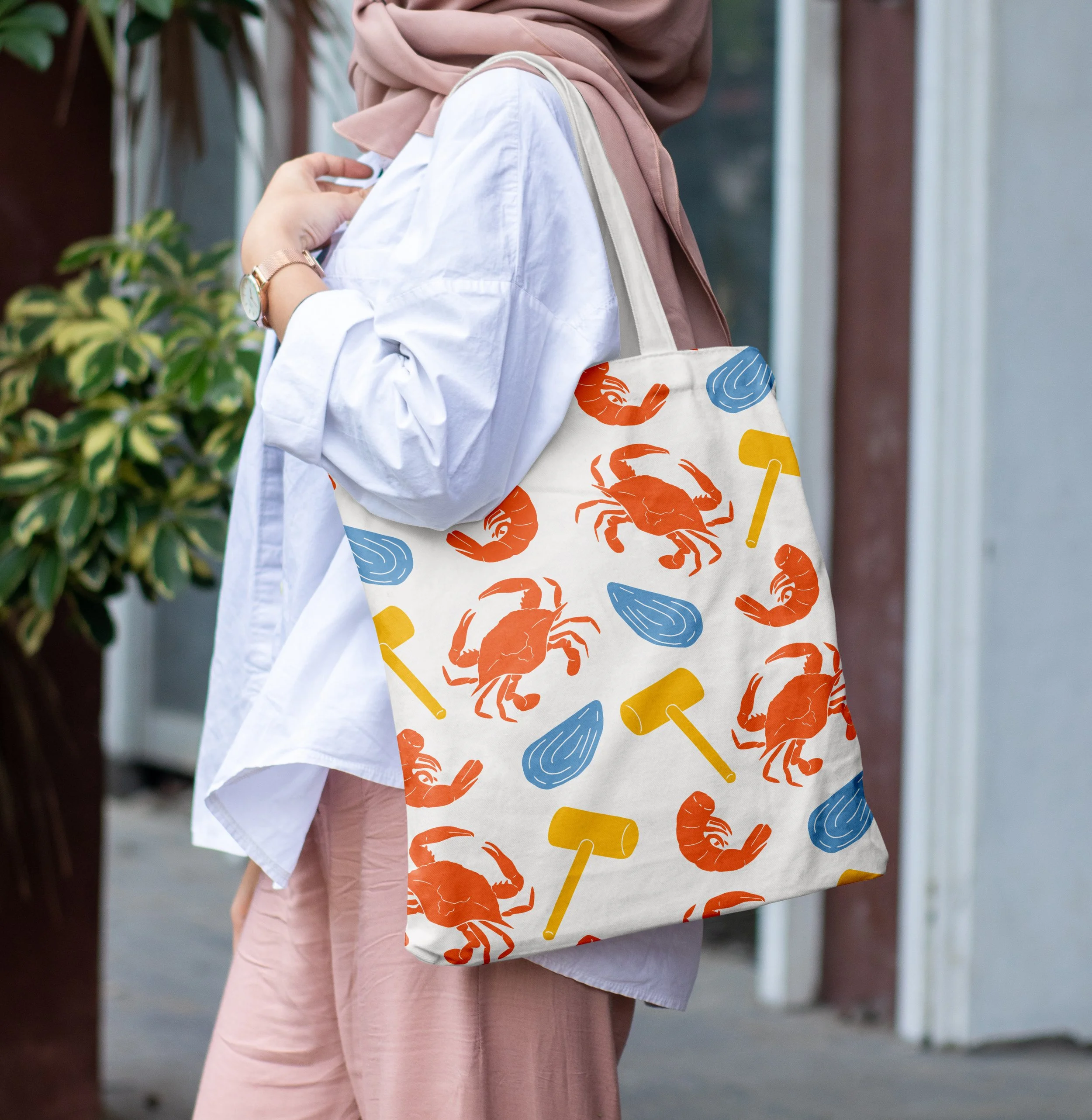
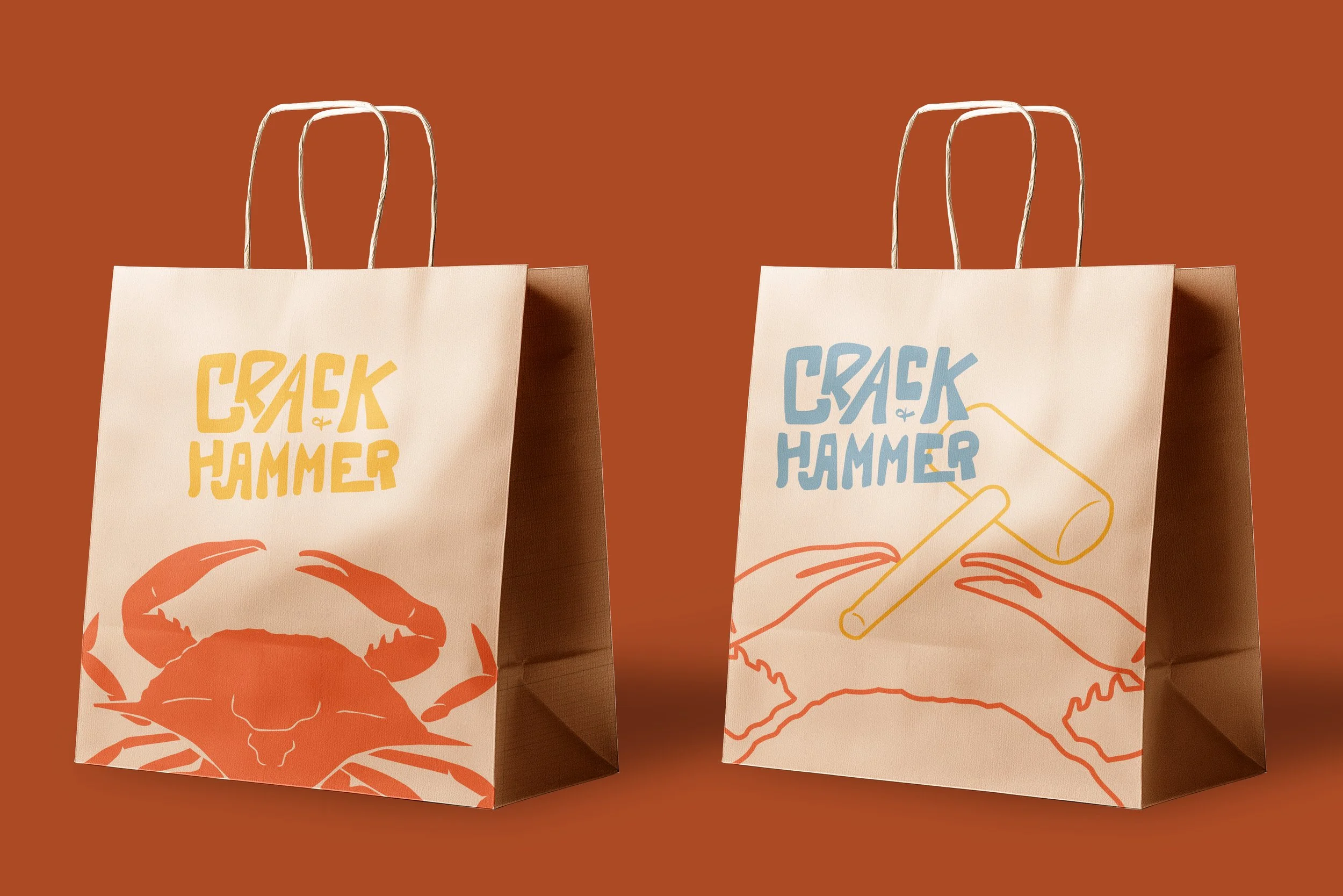
I visualized more fun ways to bring the idea to tote bags and to-go bags through patterns and interacting illustrations.
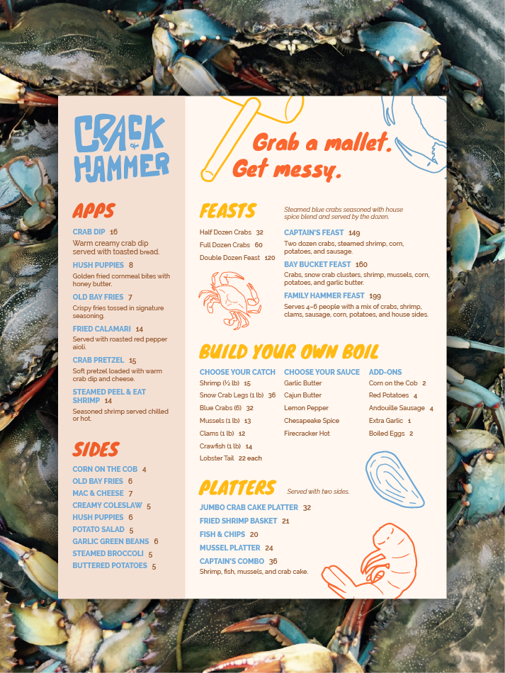
The menu brings each aspect of the brand together with its bright, inviting feel, casual headings, and icons that would inevitably get stained and messy from the endless Old Bay and butter. Along with crab feasts, there are seafood boils, platters, and appetizers. It isn’t a complete meal without hush puppies, sausage, and corn on the cob.